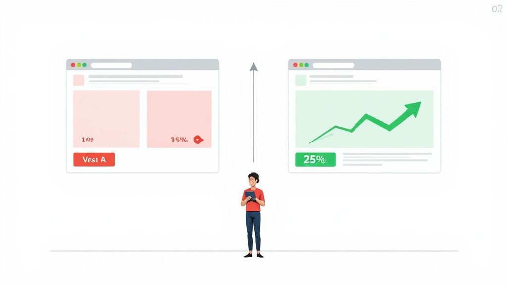
Ever wonder why some online stores feel like they're reading your mind, making it almost too easy to click "add to cart"? The secret isn't magic; it's A/B testing.
At its core, A/B testing is a beautifully simple concept. You take two versions of a webpage, show Version A to one group of visitors and Version B to another, and then see which one gets you closer to your goal. That goal could be more email sign-ups, more clicks, or—the holy grail for any e-commerce brand—more sales.
Decoding the Power of A/B Testing
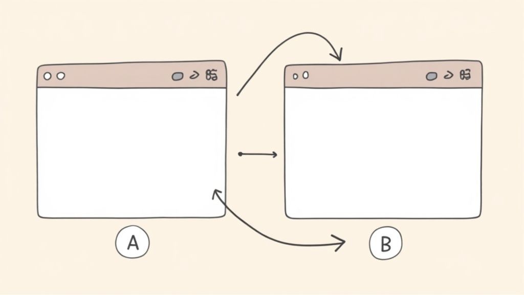
Think of it like an eye exam. The optometrist flips between two lenses and asks, "Which one is clearer, number one... or number two?" By comparing your answers, they dial in the perfect prescription for clear vision. A/B testing—often called split testing—does the same thing for your website, helping you find the "prescription" that makes your offer crystal clear to customers.
This isn't about guesswork or chasing the latest design trend. A/B testing is a powerful, data-backed method to systematically improve website conversion rates. Instead of operating on a hunch, you're letting real user behavior tell you exactly what works.
A/B Testing at a Glance
To really get a handle on this, let's break down the core components of any A/B test. This simple framework applies whether you're testing a button color or a complete page overhaul.
Understanding these three pieces is the first step to running successful tests that actually move the needle for your business.
This scientific approach isn’t just some new marketing fad, either. It’s rooted in principles developed nearly a century ago by statistician Ronald Fisher, who used randomized controlled experiments to test agricultural variables. That history is important because it shows that A/B testing is a time-tested, proven method for making smarter decisions.
By testing one variable at a time, you can pinpoint exactly what influences your customers' behavior. This removes the guesswork and allows you to make small, consistent improvements that stack up over time, leading to huge wins in performance and a much better experience for your shoppers.
Why A/B Testing Drives E-commerce Growth
So we know what A/B testing is, but the real magic is in the why. For any e-commerce brand, this isn't just some textbook theory—it's your direct line to understanding how customers behave and, ultimately, how to make more money.
Every single element on your site, from a tiny checkout button to a hero product photo, is a lever. That lever can either nudge your revenue up or drag it down. A/B testing is what lets you pull those levers with calculated precision instead of just guessing.
Think of it like compounding interest for your website. A single test might only give you a 2% lift in conversions, which doesn't sound like much. But when you consistently run tests and stack those small, validated wins one on top of the other, the cumulative effect can be absolutely massive. This process turns a static website into a dynamic, ever-improving sales engine.
From Small Tweaks to Major Wins
The real beauty of A/B testing is its power to connect tiny changes to significant business outcomes. The top e-commerce brands aren't just guessing what their customers want; they're in a constant conversation with them, using controlled experiments to get clear answers.
Here’s how that plays out in the real world:
- Slashing Cart Abandonment: Is a simple, one-page checkout better than a multi-step process? A test can reveal exactly where the friction is, directly cutting down the number of people who bail at the last second.
- Boosting Add-to-Cart Rates: Will a lifestyle photo outperform a clean, white-background shot? A simple A/B test gives you a definitive answer, backed by actual user behavior, not just opinions.
- Improving Click-Through Rates: Swapping "Buy Now" for "Add to Bag" might seem insignificant, but you’d be surprised how much a small wording change can impact the number of users taking that next step.
A/B testing is, at its core, a risk-reduction strategy. Instead of betting your entire budget on a massive, gut-feeling redesign, you can test new layouts on a small slice of your audience first. If the new version wins, you roll it out with confidence. If it loses, you've learned a valuable lesson without tanking your business.
Data-Driven Decisions Over Gut Feelings
Ultimately, A/B testing is about replacing "I think..." with "The data shows..." It’s a culture shift that's absolutely critical for sustainable growth. It forces decisions to be justified by evidence, not just the loudest voice in the room.
While A/B testing gives you the hard numbers on user behavior, you can sharpen your hypotheses even further by layering in other effective customer feedback methods.
By embracing a disciplined approach to experimentation, you build more than just a higher-converting website. You develop a deep, empathetic understanding of your customers—what grabs their attention, what frustrates them, and what truly motivates them to click "buy." That insight is the real engine of e-commerce growth, turning casual visitors into loyal fans.
Your Step-by-Step Guide to Running an A/B Test
Alright, you get the "why" behind A/B testing. Now, let's get our hands dirty and move from theory to action. Running a solid test isn't about needing a PhD in statistics; it's about following a structured, repeatable process. This is the exact roadmap CRO pros use to turn clicks and scrolls into real business intelligence.
The journey doesn’t start with a random idea. It starts with observation. Before you can fix something, you have to know where it's broken. This is your detective phase—time to look for clues.
Discovering Opportunities for Improvement
Your website is already a goldmine of data, pointing you straight to high-impact testing opportunities. You just need to know where to look. Your goal here is to find the friction points in the customer journey—those spots where users get stuck, confused, or just give up.
A great place to start is your analytics platform. Dive in and look for pages with a surprisingly high bounce rate or a disappointingly low conversion rate. Those are blinking red lights telling you something on the page is off.
By sorting your pages like this, you can quickly build a shortlist of prime candidates for your first A/B test.
But don't stop at the numbers. Tools like heatmaps give you a visual on where people are actually clicking (and where they aren’t). Session recordings let you watch anonymized user sessions as if you're looking over their shoulder. This kind of qualitative data gives you the crucial "why" that numbers alone can't provide.
Forming a Strong Hypothesis
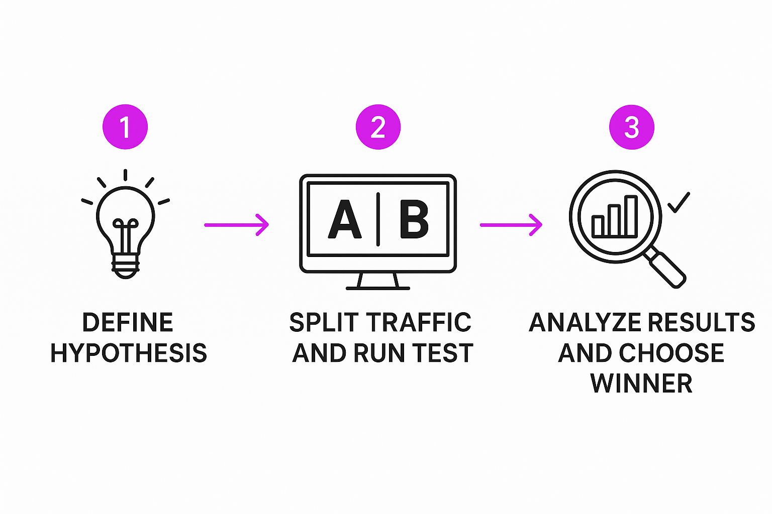
Once you’ve pinpointed a problem area, the next step is to form a hypothesis. This isn't just a wild guess. It’s a clear, testable statement about what you’re changing, what you expect to happen, and—most importantly—why you think it will happen.
A weak hypothesis is vague. Think: "Changing the button color will get more clicks." A strong one is specific and based on a real user insight.
A strong hypothesis follows this structure: "By [making this specific change], we will [achieve this specific metric improvement] because [of this specific user behavior reason]."
For example, a rock-solid hypothesis might be: "By replacing our generic product descriptions with benefit-oriented bullet points, we will increase the add-to-cart rate by 10% because customers will be able to scan and understand the product’s core value much faster."
See the difference? This format forces you to think critically about the psychology behind your test, linking a change directly to a business goal.

This simple flow shows how everything starts with a strong hypothesis. It's the foundation for a successful and insightful experiment.
Creating Variations and Running the Test
With your hypothesis ready, it's time for the fun part: building your variation (Version B). This is the new design, copy, or layout you'll test against your current version (the control, or Version A). The golden rule here? Change only one significant element at a time. If you change the headline, the main image, and the button color all at once, you'll have no earthly idea which change actually made the difference.
Once your variation is built, you’ll use an A/B testing tool to split your website traffic between the two versions. These tools are lifesavers and handle all the technical heavy lifting, making sure that:
- 50% of your visitors see the control (Version A).
- The other 50% see the new variation (Version B).
- The traffic is split randomly to keep things fair and unbiased.
- The tool tracks which version gets more people to complete your goal.
For Shopify store owners, there are a ton of fantastic apps that make this whole process a breeze. To get into the nitty-gritty, check out our detailed guide on Shopify A/B testing for platform-specific tips and tools.
Analyzing Results and Taking Action
Once your test has run long enough to collect a statistically significant amount of data (we'll cover that later), you'll have a winner. The final step is to look at the results and act on what you’ve learned.
If your variation won, that's awesome! You can now confidently roll out the new version to 100% of your audience, knowing it's a data-backed improvement.
But what if the new version lost, or the result was a tie? That's not a failure. It's a huge learning opportunity. An unexpected result teaches you something new about your customers—what they like, what they ignore, and what motivates them. Use that insight to craft a smarter hypothesis for your next test. This continuous loop of testing, learning, and improving is the real engine behind conversion rate optimization.
How to Confidently Read Your Test Results
Launching an A/B test is the easy part. The real challenge—and where all the value is hiding—is figuring out what the results are actually telling you.
Making a big business decision based on shaky data is far more dangerous than not testing at all. This is where understanding a few key statistical ideas becomes your secret weapon.
Imagine you flip a coin ten times and get seven heads. Would you run around declaring the coin is biased? Probably not. You’d instinctively know that with a tiny sample size, random chance can cook up some weird outcomes.
But what if you flipped it 10,000 times and got 7,000 heads? That's a completely different story. You’d be pretty darn confident something unusual is going on.
This simple coin-flip idea is the perfect way to wrap your head around statistical significance. It's the mathematical gut-check that tells you if your test result is a genuine winner or just a product of random luck.
What is Statistical Significance, Really?
When your A/B testing tool flags a winner with 95% statistical significance, it’s not saying the new version is 95% better. It's making a much more specific, and powerful, statement.
It means there is only a 5% probability that the difference you saw between Version A and Version B was due to pure chance. Put another way, you can be 95% confident that the result is real and would happen again if you repeated the test. This confidence level is pretty much the gold standard for making reliable decisions in CRO.
Think of it as a quality control check for your data. Hitting statistical significance is your green light to act. It confirms that the change you made is the real reason for the performance lift, not just a statistical fluke.
Ignoring this principle is a recipe for disaster. If you call a test the moment one version pulls slightly ahead, you're falling for that 10-coin-flip trap. This often leads to a false positive—implementing a "winner" that has no real impact, or worse, actually hurts conversions when you roll it out to everyone. You end up wasting time and resources chasing a ghost.
Why Sample Size is Your Best Friend
So, how do you dodge these false positives? The answer is all about reaching an adequate sample size.
Just like with the coin flips, you need to collect enough data—enough visitors and conversions—for the true performance of each version to rise above the noise of randomness. This isn't just a simple comparison; it's a scientific process designed to produce results you can trust. For a deeper dive into the nuts and bolts, you can explore the full methodology of A/B testing on Wikipedia.
Before you even think about starting a test, you need to use an A/B test calculator to figure out your target sample size. This calculation hinges on a few key inputs:
- Baseline Conversion Rate: Your current, everyday conversion rate for the control (Version A).
- Minimum Detectable Effect (MDE): The smallest improvement you actually care about. For example, you might decide you only want to detect a lift of 5% or more.
- Statistical Significance: This is almost always set at 95%.
Plugging these numbers into a calculator will tell you exactly how many visitors each variation needs before you can trust what you're seeing. Running your test until you hit this number is absolutely non-negotiable for making confident, data-backed decisions that will actually grow your business.
A/B Testing Ideas You Can Use Today

Theory is one thing, but the real magic happens when you see A/B testing in action. Let's move past the concepts and get our hands dirty with some practical, high-impact test ideas you can steal for your own e-commerce store.
I’ve broken these down by the typical customer journey, from the second a visitor lands on your site to that final, satisfying click in the checkout process. Think of each one as a real opportunity to figure out what makes your audience tick and start systematically bumping up your conversion rates.
Optimizing Your Homepage and Landing Pages
Your homepage is your digital storefront. It’s got just a few seconds to grab someone's attention, tell them why they should care, and point them in the right direction. Even small tweaks here can have a massive impact on your bounce rate.
A classic place to start is the main headline. Is it too clever? Too bland? A fantastic test is to pit a benefit-driven headline against a feature-focused one.
- Control (A): "High-Performance X1 Running Shoes"
- Variation (B): "Run Faster and Farther with X1 Cushioning"
- Primary Metric: Click-through rate on your main call-to-action (CTA).
This simple showdown quickly reveals if your customers respond more to the what or the why.
Another powerhouse element is your hero image. Does a lifestyle shot of your product in the wild outperform a clean studio photo? Maybe a short video blows them both out of the water. The goal is to find the visual that connects emotionally and screams "this is for you."
Boosting Product Page Conversions
This is it—the moment of truth. The product page is where browsers become buyers, so your job is to build trust and make the value of your product impossible to ignore. It's an absolute goldmine for A/B testing.
Take a hard look at your product descriptions. A lot of stores just roll with the generic copy from the manufacturer. Try testing that against a description rewritten in your unique brand voice, one that zeroes in on the benefits, not just the features.
- Control (A): The standard paragraph of text.
- Variation (B): A snappy paragraph paired with scannable bullet points that highlight the best parts.
- Primary Metric: Add-to-cart rate.
And don't forget the CTA button itself. It's a classic for a reason. You'd be amazed at how a simple change in wording or color can deliver shocking results.
The tech giants live and breathe this stuff. Microsoft Bing reportedly runs up to 1,000 A/B tests a month, with a single test once boosting revenue by a staggering 12%. Google famously tested 50 shades of blue, which inspired SAP to get a 32.5% conversion lift with orange CTAs and Performable to see a 21% bump with red ones.
It just goes to show you that even tiny visual changes can drive serious business outcomes. Stop assuming you know what works; let your customers' clicks do the talking.
Reducing Checkout Friction
The checkout is the final hurdle. Any bit of confusion, friction, or doubt at this stage sends shoppers straight to the "abandon cart" exit. Your mission is to make this process feel as smooth and secure as possible.
A crucial test is to play with the checkout layout. Put a single-page checkout up against a multi-step flow that has a clear progress bar. The thinking here is that one version might feel less intimidating and keep user anxiety at bay.
You can also test the trust signals you're sending.
- Control (A): A checkout page with no security badges.
- Variation (B): The same page, but with trust seals (like Norton or McAfee) and credit card logos displayed right next to the payment fields.
- Primary Metric: Checkout completion rate.
This kind of experiment tells you exactly how much your specific audience values those explicit reassurances.
Of course, a solid testing program is more than just a list of good ideas—it demands a disciplined strategy. You can dive deeper with our guide on A/B testing best practices.
To give you even more to work with, here's a table of ideas organized by funnel stage.
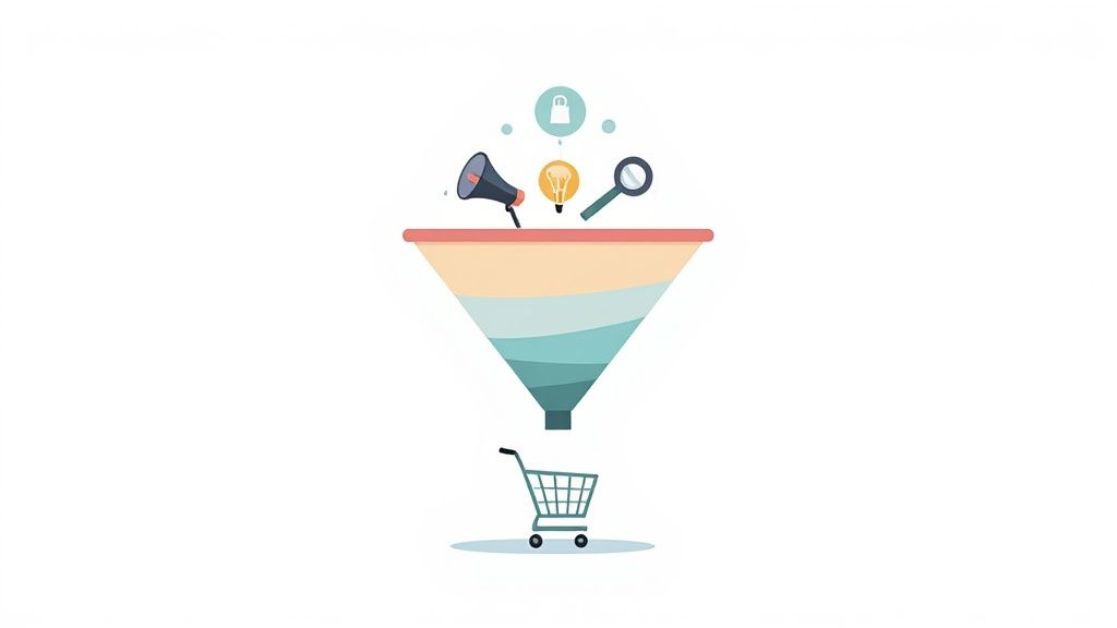
A/B Testing Ideas for Your E-commerce Funnel
These examples are just a starting point. The secret is to begin with a clear hypothesis rooted in your user data and then tackle one thing at a time. By consistently testing, learning, and iterating, you can transform your website into a finely-tuned growth engine, one validated improvement at a time.
Common A/B Testing Mistakes and How to Avoid Them
Knowing the steps to run an A/B test is one thing. Knowing how to sidestep the common traps that can completely invalidate your results? That’s something else entirely. Even seasoned pros can fall prey to simple mistakes that turn a promising experiment into a source of bad data.
If you want to build a testing program you can actually trust, you have to be vigilant about avoiding these pitfalls.
Quitting a Test Too Early
One of the most common—and costly—errors is stopping a test too early. It's incredibly tempting to call it a day the moment one variation jumps out to an early lead. But more often than not, this is just statistical noise. User behavior swings wildly; what looks like a clear winner on a Tuesday morning might completely fizzle out by Friday afternoon.
Think of it like a marathon. Declaring a winner after the first mile is just silly. Early sprints don’t tell you who will cross the finish line first. You have to let the test run its full course to get a reliable result.
Testing Too Many Things at Once
Another classic mistake is trying to jam too many changes into a single variation. When you tweak the headline, the hero image, and the button color all at once, you’ve actually created a multivariate test, not a simple A/B test. While those have their place, this approach makes it impossible to know which specific change actually caused the lift (or the drop).
To get clean, actionable data, you need to isolate one key variable per test. It's that simple.
- Good Test: Test your original headline (Control) against a new, benefit-focused headline (Variation).
- Bad Test: Test your original page against a new version with a different headline, image, and CTA copy.
This disciplined focus ensures you can attribute the outcome directly to the change you made. That’s how you get real insights to inform your next experiment.
Ignoring the Numbers and Outside Events
A lot of beginners make the mistake of trusting their gut over statistical confidence. If your testing tool says Version B is up by 10% but the confidence level is only 65%, that result means nothing. Acting on it is no better than flipping a coin. You have to wait until your test hits at least a 95% statistical significance level before you can confidently make a decision.
Context is also everything. Running a test over a major holiday, during a huge promotion like Black Friday, or in the middle of a big PR push can seriously mess with your results. User behavior during these times is anything but normal, and the data you collect won't reflect your typical customer patterns.
To avoid this, always plan your testing calendar around these major events. Try to run experiments during periods of "normal" business activity. A good rule of thumb is to let every test run for at least one full business cycle—usually a full week—to capture the natural differences between weekday and weekend shoppers. These simple precautions protect the integrity of your results and lead to much smarter, more profitable decisions down the road.
A/B Testing FAQs
Even the sharpest CRO specialists run into questions once they're in the trenches of A/B testing. Here are some quick-fire answers to the most common ones that pop up.
How Long Should an A/B Test Run?
This is a classic, but the answer isn't a simple number of days. The real driver behind your test's duration is your traffic volume and hitting a pre-calculated sample size. You absolutely need enough data to reach statistical significance.
As a general rule of thumb, always run a test for at least one full week. This helps you capture the natural ebb and flow of customer behavior—think about how different your weekend shoppers are from your weekday browsers. Calling a test the second it looks like it's winning is a rookie mistake that almost always leads to bad data.
What Is the Difference Between A/B and Multivariate Testing?
Let's use a cooking analogy. A/B testing is like comparing two totally different recipes. You cook Recipe A, and you cook Recipe B. At the end, you taste both and decide which dish is the winner. It's straightforward and perfect for testing big, bold changes.
Multivariate testing, however, is like trying to perfect a single recipe by testing multiple ingredients at once. You might try two different types of sauce with three different kinds of cheese to find the ultimate combination. A/B testing is simpler and gives you a clear "Which one won?" while multivariate is more complex, answering, "Which combination of elements performed best?"
A/B testing is your go-to for making impactful, decisive changes. It provides a clear winner between two distinct options, making it the ideal starting point for most e-commerce optimization efforts.
Can I A/B Test with Low Website Traffic?
Yes, you can, but you have to be smart about it. If your traffic is low, trying to get a statistically significant result from a tiny change, like a button color tweak, could take months—or even years. It’s just not practical. The key is to test for massive impact, not minor improvements.
Forget the small stuff. Instead, focus on high-impact tests with radically different versions. Test a completely new page layout, a fundamentally different value proposition, or a drastically simplified checkout flow. The bigger the expected difference in performance between your variations, the less traffic you'll need to prove one is a clear winner.


